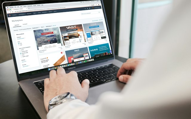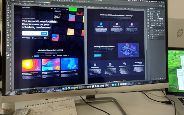

Visitors arrive on everything from budget Android phones to large monitors. A responsive layout adjusts so the page works everywhere.
Principles
- Mobile first: design the single-column phone layout, then expand.
- Flexible grids: columns that stack on small screens.
- Relative units: rem and percentages instead of fixed pixels; convert with our px to rem converter.
- Flexible images: max-width 100% and fixed aspect ratios; calculate them with our aspect ratio calculator.
Common breakpoints
Rather than targeting specific devices, add breakpoints where the layout starts to look wrong, often around 600px, 900px and 1200px.
Watch for
- Text too small on phones or too wide on desktops.
- Buttons too small to tap.
- Tables and images overflowing the screen.
- Elements hidden behind sticky bars.
Test properly
Use browser device tools, then test on real phones, including a small, low-cost Android device.
Read mobile landing pages.
Want the full picture? This article is part of Landing pages: the complete guide, our in-depth guide with everything in one place.