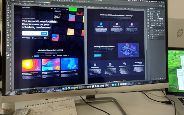

Visual hierarchy is the order in which people notice things on a page. Good hierarchy leads visitors from headline to benefits to proof to action.
Tools of hierarchy
- Size: bigger elements are seen first.
- Contrast and colour: high-contrast elements stand out; check with our contrast checker.
- Position: top and left are often seen first in many layouts.
- Spacing: white space isolates and highlights.
- Weight: bold text draws attention.
A typical order
- Headline (largest).
- Main visual.
- Subheadline.
- Call-to-action button (strongest colour).
- Trust signals.
- Supporting sections.
Common problems
- Everything is bold or bright, so nothing stands out.
- Decorative elements bigger than the message.
- Buttons the same colour as everything else.
- Crowded layouts with no breathing room.
The squint test
Squint at your page or blur a screenshot. What stands out should be the headline and main button.
Consistent type scale
Use a consistent set of font sizes; convert to rem with our px to rem converter.
Want the full picture? This article is part of Landing pages: the complete guide, our in-depth guide with everything in one place.