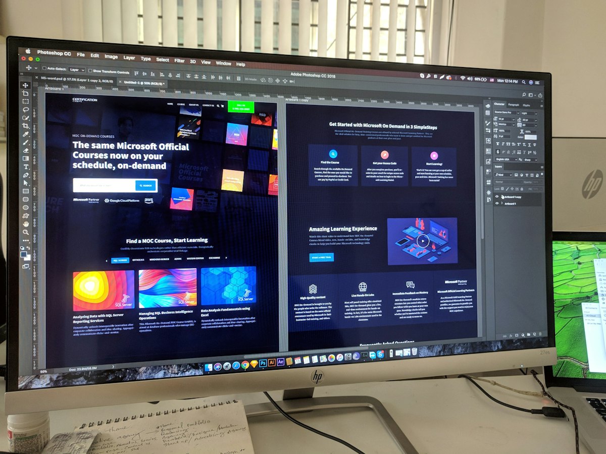
There is no magic button colour. What matters is contrast: the main action must stand out from everything around it.
A simple colour system
- Background: white or light neutral for readability.
- Text: dark grey or near-black.
- Brand colour: headings and accents.
- Action colour: used only for main buttons.
Contrast is key
The action colour should contrast with the background and not appear elsewhere. Check text contrast with our contrast checker.
Brand fit
Pull colours from your logo or product photos with our palette tool.
Cultural associations
In India, colours carry festive and cultural meanings: saffron, red and gold for celebrations, green for nature and health. Use them thoughtfully for seasonal campaigns.
Test, do not guess
Button colour tests usually show small effects; offer and headline tests matter more. Read A/B test ideas.
Read website colours.
Want the full picture? This article is part of Landing pages: the complete guide, our in-depth guide with everything in one place.