
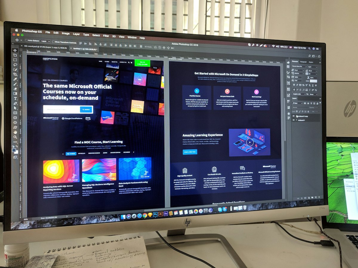
A landing page is a single page built for one offer and one action, usually for people arriving from an ad. Because it removes distractions, it turns far more visitors into enquiries than a normal home page. If you run ads, a good landing page can halve your cost per lead.
In short: one offer, one audience and one action. Use a headline that promises the result and put proof near a short form. Make it load fast on mobile, and keep testing.
When you need a landing page
- You run Meta ads or other paid campaigns.
- You promote a specific offer, event, course or project.
- You want to compare offers or messages cleanly.
- You send email or WhatsApp campaigns with one clear goal.
The structure that works
- Headline: the result the visitor wants, in their words.
- Subheading: how you deliver it, and for whom.
- Call to action: a form or button visible without scrolling on mobile.
- Benefits: three to five reasons to choose you.
- Proof: reviews, results, logos, photos of real work.
- Details: price or price range, process, what is included.
- FAQs: answer the doubts that stop people enquiring.
- Final call to action.
Headlines that earn attention
Match the headline to the ad that brought the visitor. Formulas that work:
- Get [result] without [pain].
- [Result] for [audience] in [time frame].
- The simplest way for [audience] to get [result].
Our landing page headline generator creates options in seconds.
Forms that people finish
- Ask only what you need to follow up: usually name and phone, sometimes email.
- Add one or two qualifying questions if lead quality matters, such as budget or timeline.
- Use a clear button that says what happens: “Get my free quote”, not “Submit”.
- Offer WhatsApp as an alternative for people who prefer to chat.
Building trust quickly
Visitors from ads do not know you yet. Put proof near the form: star ratings, short reviews with names, numbers from real results, and photos of your team or work. Show your address and phone number too.
Speed and mobile
Most ad clicks in India happen on phones. Keep the page light, compress images, and test on a mid-range phone on mobile data. Every extra second of loading loses visitors you already paid for.
Tracking every lead
Send every form to a thank-you page and track it as a conversion in Meta and Google Analytics. Add UTM tags to your ad links with our UTM link builder so you know which ad brought each lead.
A/B testing: improving over time
Change one thing at a time, such as the headline, offer or form length, and send half your visitors to each version. Run tests for full weeks and until you have enough visitors. Our sample size calculator tells you how many you need, and the A/B test calculator tells you whether the winner is real.
Common mistakes
- Sending ad traffic to the home page.
- Several offers and buttons competing on one page.
- Long forms asking for details you do not need yet.
- No proof or contact details.
- No tracking, so nobody knows the conversion rate.
Your landing page checklist
| Must have | Should have | Then test |
|---|---|---|
| Headline matching the ad | Reviews and results near the form | Headline variations |
| Form or button above the fold on mobile | Price range and FAQs | Offer and form length |
| Thank-you page and conversion tracking | WhatsApp option | Images and layout |
See our landing page design service and the cost guide.